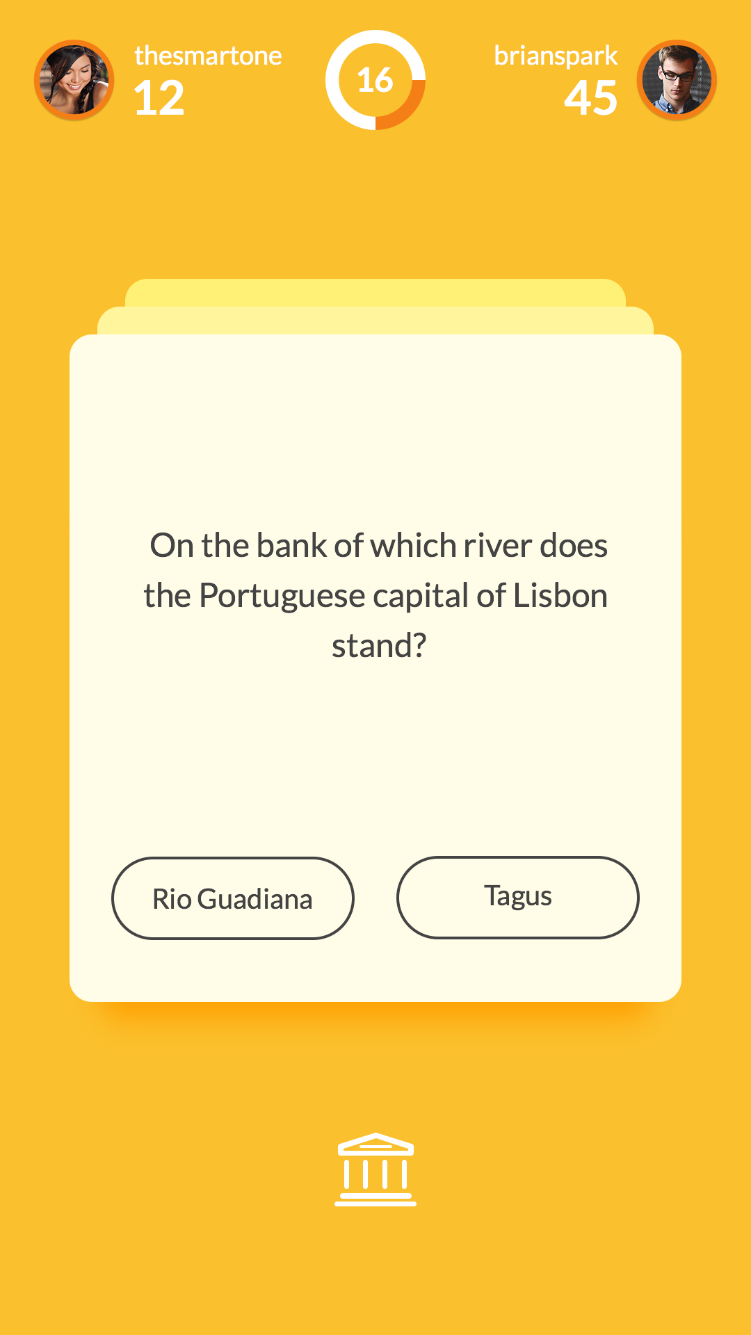
This quiz app shows the questions as card, which you can visibly see are stacked behind eachother, this is a way you can see how many questions you have left to answer. The actual question only has 2 answers, which means that the buttons can be small and placed next to eachother. The style is flat, and the colour scheme limited to shades of yellow.
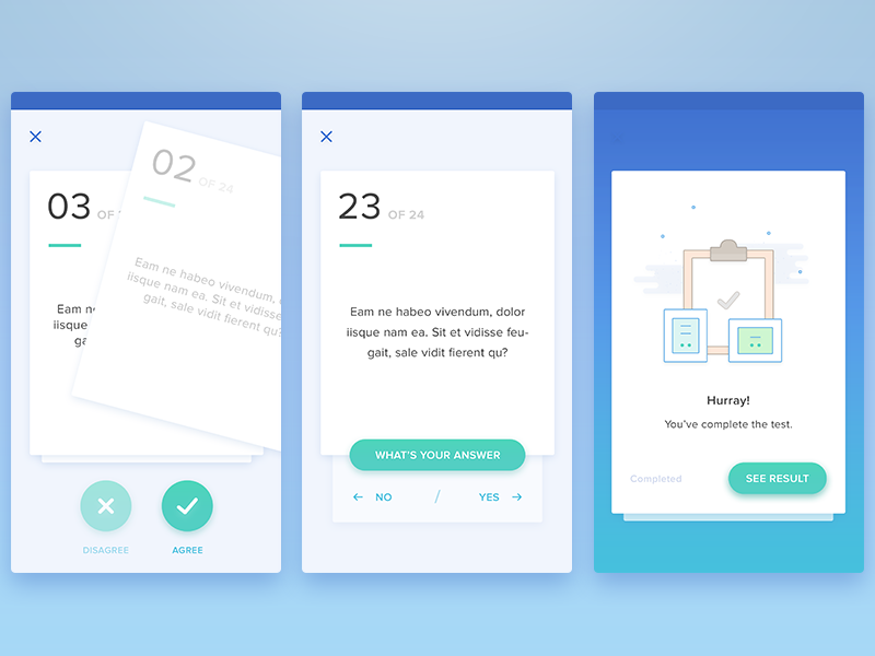
This app has a similar layout to the app above, with the questions for the test stacked in cards behind eachother. To indicate how many questions are left the number is stated in large text on the top left of the card. The format of this test only has a yes or no answer though, so is represnted through symbols, a tick and cross. The colour scheme is shades of blue and green as well as off white, and the background for one screen features a gradient.
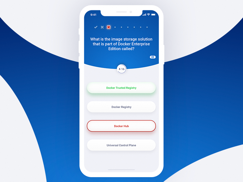
This screen taken from a quiz app proves to me how much space can be given to the layout of the screen. The text is smaller than I thought it would be considering the size of the screen, and there is room for the question, which is encased in an arc, as well as buttons below the question. The buttons show right and wrong answers indicated by green and red borders and text respectively, and the buttons feature a shadow to lift them off the page. I also like how this screen is presented, on a similar style background behind the phone.

This screen also features a lot of text, however most of it is placed in a fact below the actual quiz, assisting to the edcuation of the individual. This would have been a cool feature to implement in my app, unfortunately, most of the text will be contained within the question and answers instead. The actual design of the app does not seem very professional to me, this could be due to the thickness of the text which seems too heavy to me. Also the colour scheme does not appeal to me, I think the colours should possibly be a bit lighter.

I love this app design as the use of colours and gradients really make it stand out from the others I have seen. The use of illustration makes it visually very pretty, while I like this though this probably would not be very relevant within my own app. I like the rounded corners on the boxes though as this gives the app some softness and also reflects the corners of the iPhone. The text for the quiz section has a lot of room to breathe, showing me that it will be possible to fit the amount of text into the quiz that I need to. In particular I love the gradients of this app, this is something I could use in my own designs as I am working with colour and could create different tones to make the app appear less flat and more visually appealing.
No comments:
Post a Comment