In order to create an app that works well for the user I decided to research the rules behind UI creation. This list of rules uses Photoshop as an example to back up their 10 tips on creating good UI design.
1. Visibility of System Status
Photoshop does a great job of letting the user know what’s happening with the program by visually showing the user what their actions have led to whenever possible. For example, when users move layers around in the Layers palette, they can visually see the layer being represented as physically dragged within the space.
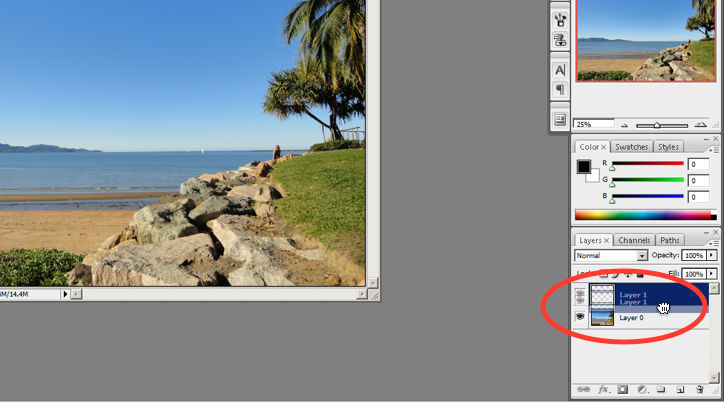
The cursor graphic goes from representing an open-hand to a gripped hand when the user drags a layer around within the Layers palette. This makes it’s easy to instantly understand the system status. Additionally, Adobe’s choice of using a ‘hand’ is a great example of the second guideline where the system matches the real world.
2. System Match to the Real World
An example of Photoshop mimicking the real world in terms and representations that their target users would understand, is where they design the information structure and terminology to mirror the same wording we would use in the world of photography or print media. Familiar concepts and terms like RGB, Hue/Saturation/Brightness and CMYK are used to represent , while various tools like the dodge tool and the burn tool mimics a traditional darkroom technique for photographs.
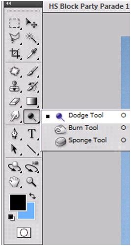
Photoshop’s Dodge Tool and Burn Tool mimics a traditional darkroom technique for photographs
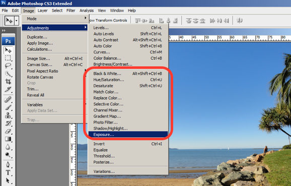
Photoshop utilizes the term, “Exposure”, as commonly used in the world of photography.
3. User Control and Freedom
Photoshop is very good at providing users with control every step of the way. As the user makes changes to an image or adds various artistic effects, they are able to quickly and easily take a step backwards if they make an error, for instance.
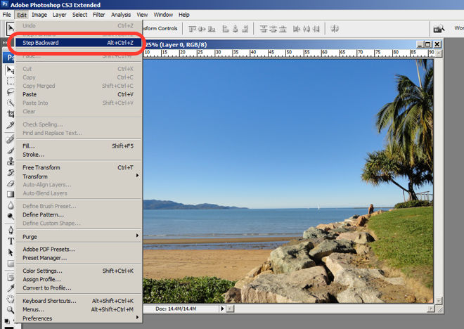
The users are in control as they can take a Step Backward or Step Forward under the Edit menu, or alternatively they can use Photoshop’s keyboard shortcuts like Alt+Ctrl+Z, for example.
4. Consistency and Standards
Photoshop maintains a standard layout and look & feel when it comes to the menu bar. They also utilize commonly known terminology such as “New…”, “Open…”, “Save As…”, etc.
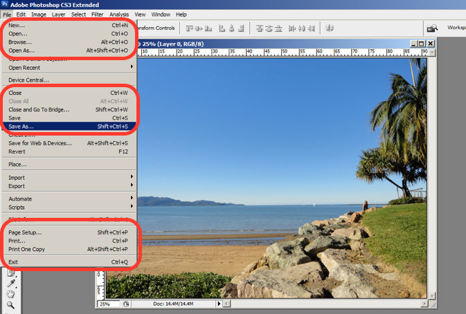
The File menu in Photoshop displays a variety of highly familiar options.
5. Error Prevention
To prevent users from making errors, Photoshop provides a brief description or label of the tools when a user hovers over it to help make sure users are using the proper tool for the task at hand.
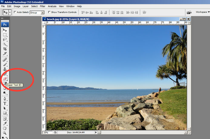
The user hovers over the eraser icon and Photoshop displays the “Eraser Tool” label.
6. Recognition rather than Recall
Whether it be making a selection from the artistic filters menu, or opening a new image file, Photoshop provides a sample view for users to make the right choice. This allows for the user to visually recognize what they’re looking for instead of having to recall the name or typing it in to search for it. Perhaps you have encountered other photo editing programs which ask you to recall and type the name of the file you want to work on. This can indeed be really difficult to recall as it is often something to the effect of: 29412_09342.JPG.
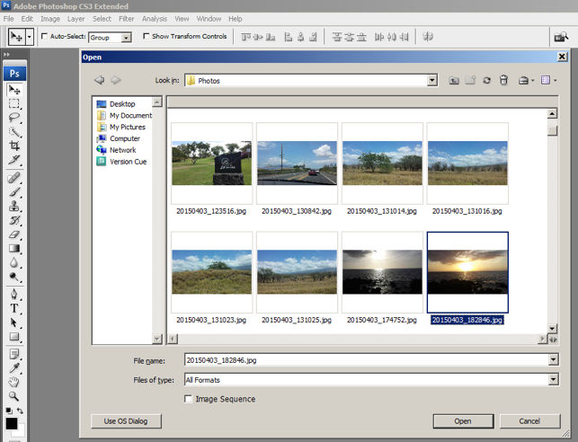
The user is able to visually recognize the sunset image by its thumbnail and select it.
7. Flexibility and Efficiency of Use
One of the many reasons for frequent users to love Photoshop is for its flexibility and efficiency. Users are able to utilize its flexibility by organizing and adding to their Workspace, as well as making things more efficient by saving it for future use.
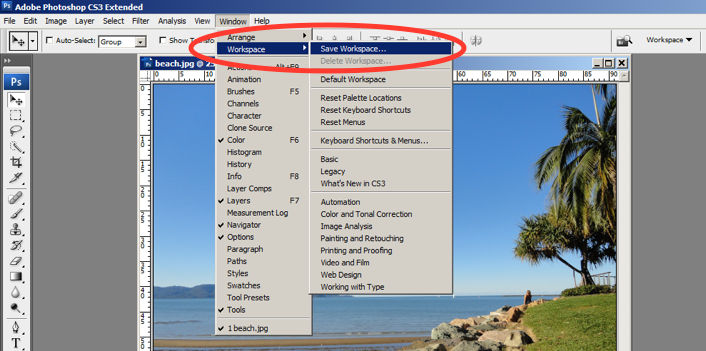
Photoshop gives frequent users the ability to save their preferred workspace-setup.
8. Aesthetic and Minimalist Design
The toolbar in Photoshop only displays the icons and is neatly tucked to the side to help keep clutter to a minimum, and maintain a minimalist aesthetic.
The Photoshop toolbar is minimalist and avoids clutter by representing the tools with icons only.
9. Help Users Recognize, Diagnose and Recover from Errors
Whenever there is an error, Photoshop provides dialogue that lets the user know what went wrong and how to fix it.
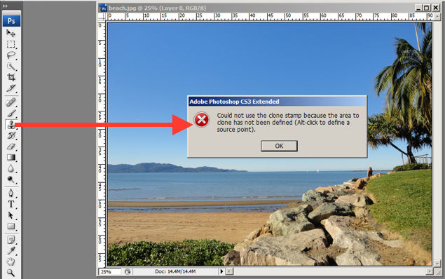
In this error message for the user’s misuse of the clone stamp, Photoshop explains what went wrong, the reason why and how the user should proceed from there.
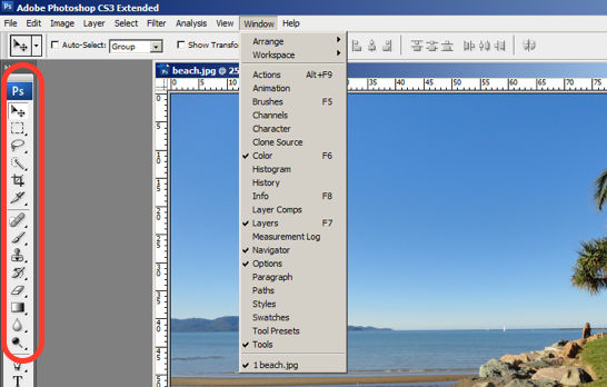
10. Help and documentation
Help and documentation can be accessed easily via the main menu bar. From there, you can find a wide variety of help topics and tutorials on how to make full use of the program.
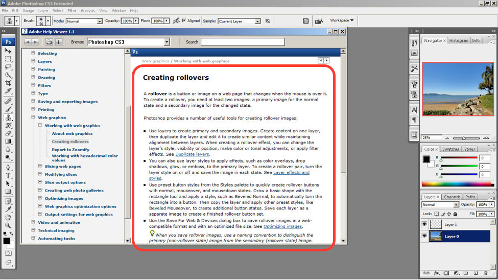
The window displays information on how to create rollovers in the context of web graphics. The user is also able to see a list of topics on the side menu.
Whilst most of this post focuses on Photoshop as a system and most of the advice cannot be applied to an app design I still found this page interesting and helpful because it helped me to decide which pages I should cut out of my app. The Error Prevention (by providing a label) and the Help and documentation tip helped me to see that the dictionary page on my app is actually very helpful to users and by providing a way for users to understand the questions they are answering by providing a definition (or label), and combining these all in one place, the user can refer back to these definitions which gives them a greater understanding. I will continue to do more research into app specific UI design tips.
No comments:
Post a Comment